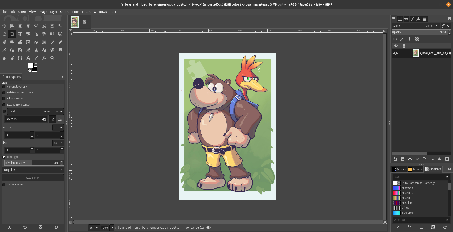
For what i heard, a lot of people on the Linux community use Krita for image manipulation, even though, it’s intended for digital painting, and GIMP is the one intended for image manipulation, because people don’t like the GIMP’s UI.
My issue is, i never understood why they don’t like the GIMP’s UI, since i never have issues with it,(Although it’s probably because i’m used to the UI) so i need to adress this problem and ask you What does the GIMP UI has that you don’t like or hate so much and why you like Krita’s UI over GIMP’s?
Before you event comment your answer i need to ask you to do the following:
-
Address each specific issue along with an concise and direct explanation of why you don’t like it
-
Answers such as “I just don’t like it”, “I don’t like where it’s placed” or anything alike doesn’t count as “Concise and Direct”, we are adults, not 4 year old children.
-
If you can provide a suggestion of how GIMP’s UI can be improved, it would help a lot, and maybe this issue can be solved.
-
If someone else commented something you were about to comment, upvote them, this way we can address the most common issues effectively.
-
I need you to watch the screenshots of both UI’s, because something that most people don’t know, it’s how similar Krita and GIMP’s UIs are.
Krita’s UI

GIMP’s UI

(Credits to a friend of mine for lettig me use the screenshots.)
My ideas on how GIMP can improve it’s UI
-
Adding the option of the new UI selected by default, but with the possibility to switch to the new UI.
-
Possibly addding “work spaces” like Krita would help too, along with the possibility of exporting and importing them, this way people can have custom arrangements of the UI according to the kind of work they will do.
Thanks for reading and hopefully we can address this issue effectively.


UI is dated, for one.
range inputs can’t be scrolled, dragged around the screen, and are absurdly small on high DPI screens.
There’s a load of UX issues, such as how pasting content will create a new layer that is for some reason more limited than a typical layer.
Feature discoverability is poor. Most features are buried in years-old dropdown tabs that aren’t kept up to date with UI/UX expectations.
Some features are incredibly obtuse in how they explain themselves: selecting a brush dynamic selects stuff from a massive scrolling list with nothing but a title to explain what they do.
UI is inconsistent. Some elements are clearly older than others even after ““recent”” (years-old) updates.
There’s way more, btw. But honestly if this years-long push to get GIMP to GTK 3 has told me anything, it’s that the project should’ve canned the update years ago and written an entirely new app from scratch, dropping the technical debt, the archaic choice of language and UI toolkit, and they still would’ve come out with a new version faster than they have now.