

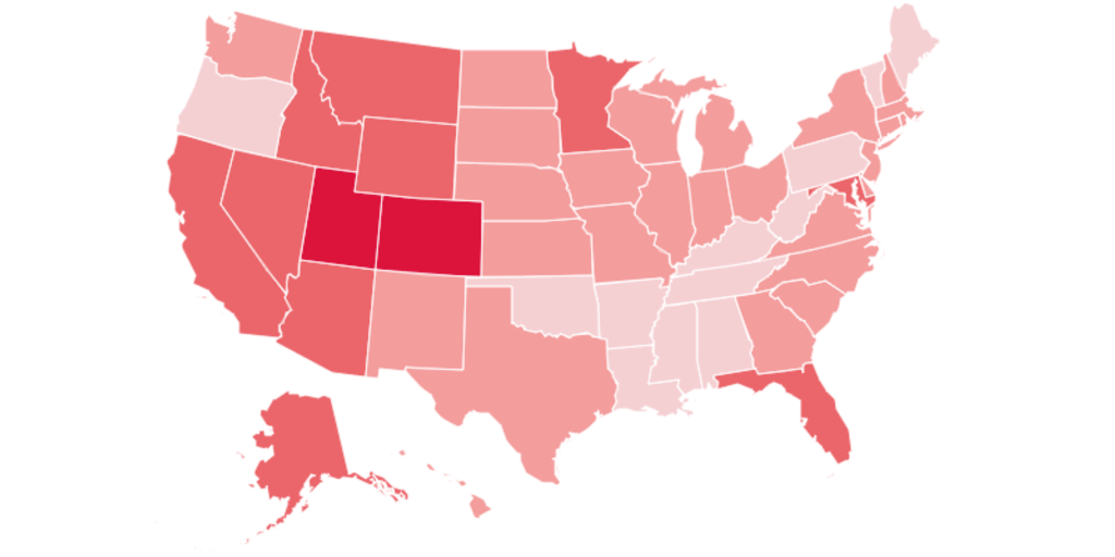
How many things can you find wrong with this map?
I can’t tell what the bottom legend is supposed to represent. The colors certainly have nothing to do with the individual state inflation rates.
You must log in or register to comment.
How many things can you find wrong with this map?
I can’t tell what the bottom legend is supposed to represent. The colors certainly have nothing to do with the individual state inflation rates.