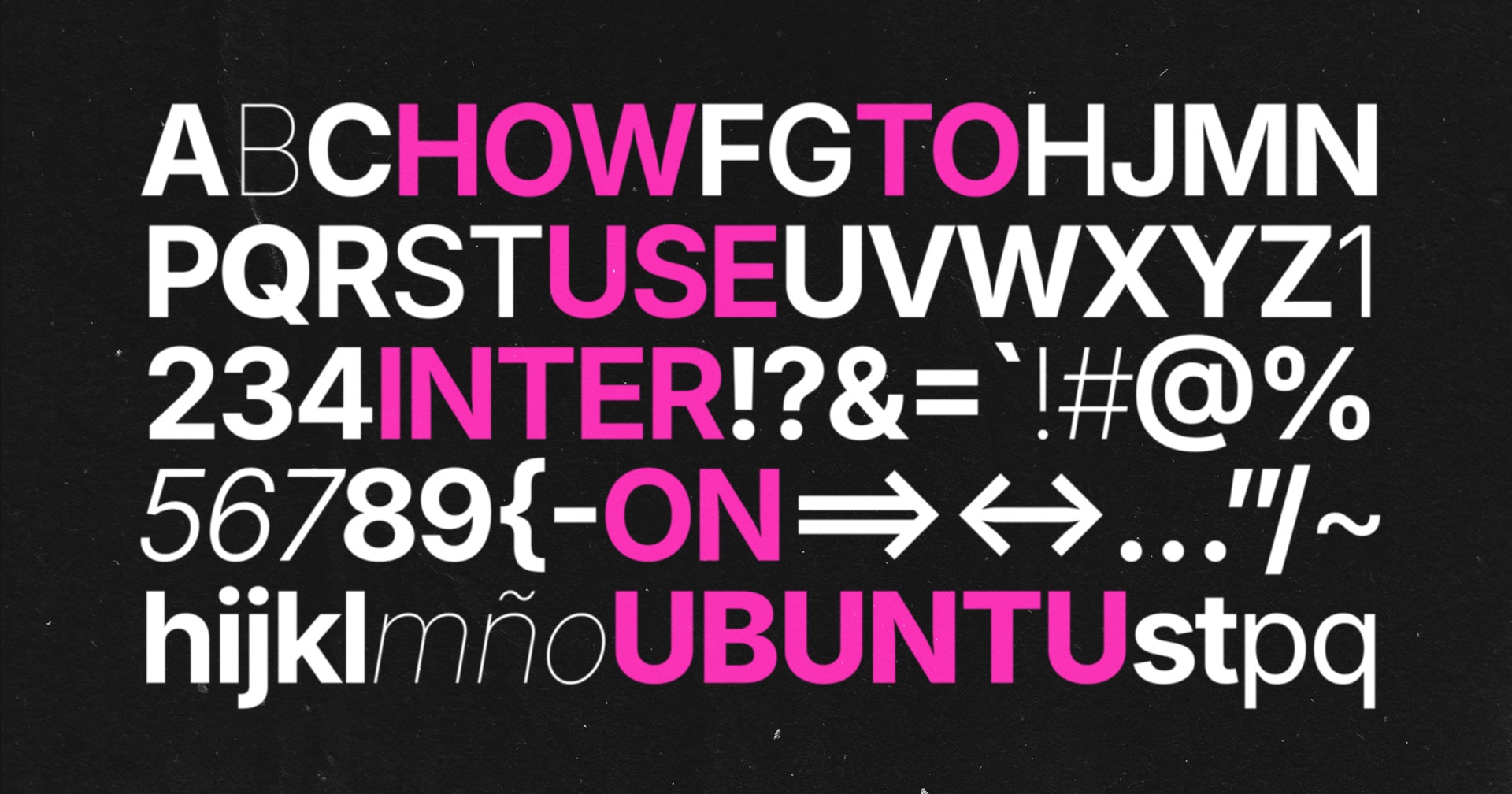
The article isn’t great as it fails to mention that Gnome is considering a variation of Inter and not the default and therefore the article uses the wrong font in the screenshot. It addresses some of the concerns people have mentioned, like the capital I and lower l being the same
Whenever I read something on the lines of X`s new Y, I think of Curt’s new hat.
deleted by creator
Cantarell has served us well, but we’ve been wondering if it would be more beneficial to default to a more modern and well-maintained typeface
Eh. I don’t feel Cantarell “dated” or “not modern”. I don’t even use GNOME anymore but I reckon Cantarell is actually a great font, it’s legible and has character. It’s almost like you can tell it’s about GNOME when you see Cantarell somewhere. If I were them I’d invest into giving it more weights (I’d really like it if it had a lighter version), variations and extending it. They have the power and resources to do so.
imho they’re trying to solve a problem that doesn’t even exist. Inter’s default is a poor choice, as some of you have already noted here.
honestly I don’t see why they put effort into making a new font. there are plenty of freely available ones that are good enough