

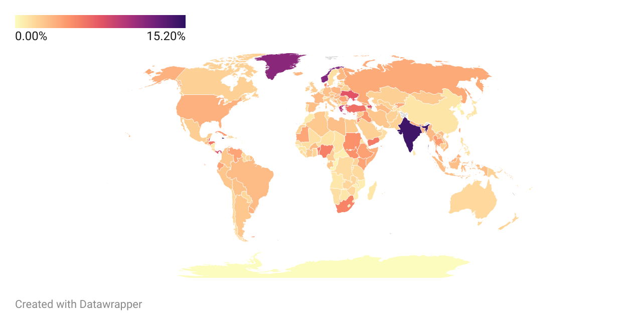
This is probably not the best Choropleth map, but it should give a decent understanding about the share of Linux user within that particular country
How to read?
This map compares the Linux share of that particular country - this is not a world-wide population distribution of OS user. You’re supposed to read it more like: “Within the ‘X’ country, there is a ‘x’% of Linux user”, not “‘X’ country has ‘x’% of Linux users”
Assumptions
-
Some regions, like for example, Kosovo has the same value as Serbia, as it is not recognized by Statcounter Global Stats.
-
Likewise, a few countries and islands were not recognized by Datawrapper, like for example, the Virgin Islands. So, I just chose to simply ignore those values.
Countries with user share more than, or equal to 6%
Note: within their own internet users
| Countries | % of share |
|---|---|
| Jamaica | 15.2% |
| India | 14.51% |
| Seychelles | 13.34% |
| Norway | 11.91% |
| GREENLAND (DNK) | 11.53% |
| Greece | 9.51% |
| Panama | 8% |
| SAO TOME AND PRINCIPE | 7.97% |
| Azerbaijan | 7.91% |
| Ukraine | 7.75% |
| Belize | 7.66% |
| Malta | 6.95% |
| Turkey | 6.4% |
| Honduras | 6.31% |
Essentially Linux has today the market share OSX had back in 2005 or something like that. That is kinda encouraging! Now we just need for Microsoft to keep fucking windows up!