

- cross-posted to:
- memes@lemmy.world
- cross-posted to:
- memes@lemmy.world
cross-posted from: https://lemmy.world/post/17714161
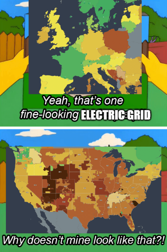
Source - The colors of the grids represent CO2 emissions
The title is a reference to the 2021 Texas power crisis
You must log in or register to comment.
Did they merge Belarus and Ukraine on this map? Also Poland’s out here trying to be American.
Poland loves her coal
Poland is actually trying to be Amerikkkam, they are obsessed. They even tried going for the extreme racism.
In terms of area, aren’t the size of the various American grids roughly the same size as the ones that comprise the individual countries in Europe?
Yes, for a sense of scale, Pennsylvania (rectangular one in the top right) is about the size of England
So sad that they don’t have data for most of africa btw
The bigger the grid the bigger the impact of failure (which does happen) and the harder to get it back up.
You want a grid big enough to have some variety in use, generation, and weather, but not so big that one malfunction takes out everyone.
Aside from Texas, the US grid is just fine.
What the fuck are u talking about? Do u even know what the map shows?


