

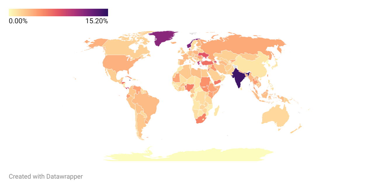
This is probably not the best Choropleth map, but it should give a decent understanding about the share of Linux user within that particular country
How to read?
This map compares the Linux share of that particular country - this is not a world-wide population distribution of OS user. You’re supposed to read it more like: “Within the ‘X’ country, there is a ‘x’% of Linux user”, not “‘X’ country has ‘x’% of Linux users”
Assumptions
-
Some regions, like for example, Kosovo has the same value as Serbia, as it is not recognized by Statcounter Global Stats.
-
Likewise, a few countries and islands were not recognized by Datawrapper, like for example, the Virgin Islands. So, I just chose to simply ignore those values.
Countries with user share more than, or equal to 6%
Note: within their own internet users
| Countries | % of share |
|---|---|
| Jamaica | 15.2% |
| India | 14.51% |
| Seychelles | 13.34% |
| Norway | 11.91% |
| GREENLAND (DNK) | 11.53% |
| Greece | 9.51% |
| Panama | 8% |
| SAO TOME AND PRINCIPE | 7.97% |
| Azerbaijan | 7.91% |
| Ukraine | 7.75% |
| Belize | 7.66% |
| Malta | 6.95% |
| Turkey | 6.4% |
| Honduras | 6.31% |
I honestly doubt that every 10th user in Norway is using Linux.
I assume data comes from statcounter.com. I looked at Norway there.
Browser market share: Firefox June 2023: 2.65%. September 2023: 36.27%!!! December 2.46%.
This does not compute. Similarly for Desktop OS. Linux in Norway has 3.41% is September, but 16.99% in November?